4 releases (2 breaking)
| 0.3.0 | Feb 7, 2025 |
|---|---|
| 0.2.0 | Dec 19, 2024 |
| 0.1.1 | Oct 3, 2024 |
| 0.1.0 | Oct 3, 2024 |
#292 in GUI
481 downloads per month
Used in 4 crates
180KB
1K
SLoC
egui_flex
I was curious how much of flexbox I could implement in egui in a single-pass layout, by just remembering the sizes of widgets from the previous frame. Turns out it's quite a lot!
First of all, here is a good refresher of what all the different flex keywords mean.
The following things work as expected:
-
flex-direction: row and column work as expected (I've named them horizontal and vertical to match egui's layout names)
-
flex-grow: you can give items a grow factor and they will grow to exactly fill the available space. An item with grow: 2 will grow twice as much as an item with grow: 1
-
align-items / align-self:
-
align-items-content / align-self-content: egui-specific property I added to help align an item's content if it has
grow > 0.0 || align_self == Stretch -
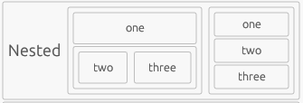
nested flex containers work and will grow as expected as long as they don't wrap:
Every group in the screenshot represents a flex container or flex item so this shows flexes nested three levels deep.
You can't arbitrarily nest flexes in child ui's, you have to use a special method on the flex builder to add nested flexes, because it needs to communicate it's minimal size to the parent flex.
-
flex-wrap wrap and no-wrap works, wrap-reverse is not implemented
- if
wrap, items will fill the row and wrap once they reach Ui::available_width() - else, items will fill the row and overflow if they don't fit
- if
The following things aren't implemented yet but should be possible:
- justify-content: should be easy to add
- handling wrapping in nested flex: not 100% certain but I think this should be possible
- max width: with flex-grow it's currently not possible to set a max width right now
The following things are not possible
- flex shrink: Getting a items intrinsic size requires adding the item without limiting it's size and to shrink an item we must limit it's size. Shrinking an item with a fixed size should in theory be possible.
Here's a demo showing how nice things flow into the next row when resizing the window:
https://github.com/user-attachments/assets/3f8d324e-7e51-4f4b-9415-f2d61e24d322
Real world example
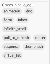
Finally, I wanted to share a real world example how flex can improve the ui by a lot. In the hello_egui demo app I have a list of crates displayed as small tags in the sidebar. When just shown with ui.horizontal_wrapped it looks really weird:
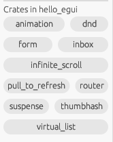
When updated to use egui_flex it looks much nicer:
Example
Here is a simple example of how to use egui_flex:
use eframe::NativeOptions;
use egui::{Button, CentralPanel};
use egui_flex::{item, Flex, FlexAlignContent};

fn main() -> eframe::Result {
    eframe::run_simple_native(file!(), NativeOptions::default(), |ctx, _frame| {
        CentralPanel::default().show(ctx, |ui| {
            Flex::horizontal().show(ui, |flex| {
                flex.add(item().grow(1.0), Button::new("Growing button"));
                flex.add(item(), Button::new("Non-growing button"));

                // Nested flex
                flex.add_flex(
                    item().grow(1.0),
                    // We need the FlexAlignContent::Stretch to make the buttons fill the space
                    Flex::vertical().align_content(FlexAlignContent::Stretch),
                    |flex| {
                        flex.add(item(), Button::new("Vertical button"));
                        flex.add(item(), Button::new("Another Vertical button"));
                    },
                );
            });
        });
    })
}
Dependencies
~4–10MB
~88K SLoC


