49 releases
| 0.3.1-alpha4 | Mar 25, 2022 |
|---|---|
| 0.3.1-alpha3 | Aug 13, 2020 |
| 0.3.1-alpha2 | Apr 22, 2020 |
| 0.3.1-alpha1 | Nov 15, 2019 |
| 0.0.6 | Dec 17, 2015 |
#927 in Procedural macros
187 downloads per month
Used in 3 crates
4MB
20K
SLoC
The Orbital Widget Toolkit is a cross-platform (G)UI toolkit for building scalable user interfaces with the programming language Rust. It's based on the Entity Component System Pattern and provides a functional Reactive-like API.
The main goals of OrbTk are speed, ease of use, and cross-platform compatibility.
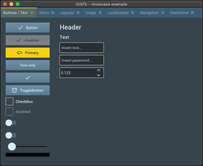
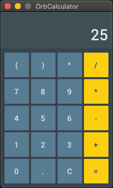
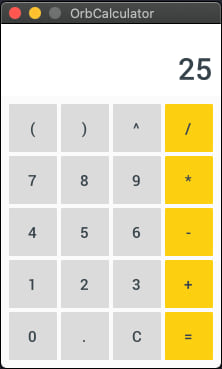
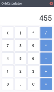
Screenshots
The next images are taken from example applications, that have been compiled for MacOS / OS-X.
- The
showcaseexample
- Themed
calculatorexamples
Other screenshots have been rendered from examples code, that is stored
inside the orbtk crate.
Features:
- Modern lightweight API
- Cross platform
- Modular crates
- Based on Entity Component System library DCES
- Flexible event system
- Integrated widget library
- Custom widgets
- Custom theming engine
- Dynamic theme switching
- Integrated debugging tools
- Localization
Platforms
- Redox OS
- Linux
- macOS
- Windows
- openBSD (not tested, but should work)
- Web (broken, will be fixed soon)
- Android (wip, will be released soon)
- iOS (wip, will be released soon)
- Ubuntu Touch (on hold)
Planned features
- Conformable use of async
- More default widgets
- Book
- Animations
- Split application in modules
- 3D context
- More integrated debugging tools
Documentation
Build and open documentation
You can build and view the latest documentation by executing the following command:
cargo doc --no-deps --open
OrbTk book
The OrbTk book is written from a developers perspective. It aims to introduce the basic concept, beside a bird's eye view of the toolkit structure. An in depth discussion of the provided crates is followed by example listings. This section collects example code with annotated blocks. The annotations are targeting best practice usage of available widgets, their interaction with other modules coupled with a descriptive text where reasonable.
A precompiled version is available for online reading. You are invited to checkout its repository at OrbTk book.
Please do not expect at finalized version. It is not complete at
all. The given statis is marked as work in progress (WIP). Any help to
improve the chapters and/or translations are quite welcome.
Usage
To include OrbTk in your project, add this dependency
line to your Cargo.toml file:
orbtk = "0.3.1-alpha4"
To use the latest development version of OrbTk, add this dependency
line to your Cargo.toml file:
orbtk = { git = "https://github.com/redox-os/orbtk.git", branch = "develop" }
You can also check out the OrbTk template project to start a new project: https://github.com/redox-os/orbtk-template
Minimal Example
use orbtk::prelude::*;

fn main() {
	  Application::new()
		.window(|ctx| {
			Window::new()
				.title("OrbTk - minimal example")
				.position((100.0, 100.0))
				.size(420.0, 730.0)
				.child(TextBlock::new().text("OrbTk").build(ctx))
				.build(ctx)
		})
		.run();
}
Base concepts
Widget
Widgets are the building blocks of user interfaces in OrbTk. They are things like Buttons, TextBoxes, ListViews, Views (Screens) and Grid(Layout)s. Each widget implements the Widget trait and is generated by the widget! macro. A widget consists of a name like Button and a list of its properties like text: String, background: Brush or count: u32. After the build method of a widget is called it's added to the Entity Component System where it exists as an Entity (index) with Components. The struct of a widget serves as a builder using the builder pattern.
Basic usage of the widget! macro:
widget!(
	MyWidget {
	  background: Brush,
	  count: u32,
	  text: String,
	  ...
	}
);
Widget Templates
Each widget has to implement the Template trait. The template defines the default values of a widget's properties as well as its structure. A
Button e.g. consists of a Container widget, a StackPanel widget and a TextBlock widget.
Basic usage of the Template trait:
impl Template for MyWidget {
	fn template(self, id: Entity, ctx: &mut BuildContext) -> Self {
		 self.name("MyWidget")
			.style("my_widget_style")
			.background("#000000")
			.count(0)
			.text("Initial text")
			.child(Container::new()
					// Container references the same background as MyWidget
					.background(id)
					.child(TextBlock::new()
							// TextBlock references the same text as MyWidget
							.text(id)
							.build(ctx)
					)
					.build(ctx)
			)
	}
}
Widget State
The state of a widget is used to update its inner state. Each state has to implement the State trait. The inner state of a widget is represented by the current values of its properties.
Basic usage of the state trait:
#[derive(Default, AsAny)]
struct MyState {
	...
}

impl State for MyState {
	fn update(&mut self, _: &mut Registry, ctx: &mut Context) {
		// update the widget
		...
	}
}

widget!(
	// Add MyState as state of MyWidget
	MyWidget<MyState> {
		...
	}
);
The Context parameter of the update method provides access to the state's widget (entity) and its properties (components). It also provides functions to access the children of the widget, and to manipulate the widget tree.
Styling widgets and define themes
OrbTk provides a theme engine base on RON. The engine provides the following features:
- Split theme in different files
- Outsource resources like colors and font stuff
- Derive styles
- Dynamic theme switch
- State styling (pressed | selected | focused | disabled)
Short example:
Theme (
	styles: {
		"base": (
			properties: {
				"font_size": "$FONT_SIZE_12",
				"font_family": "$MEDIUM_FONT",
			}
		),
		"button": (
			base: "base",
			properties: {
				"background": "$BLACK",
			},
			states: [
				(
					key: "pressed",
					properties: {
						"background": "$WHITE",
					}
				)
			]
		)
	},
	resource: {
		"BLACK": "#000000",
		"WHITE": "#ffffff",
		"MEDIUM_FONT": "Roboto-Medium",
		"FONT_SIZE_12": 12,
		"FONT_SIZE_16": 16,
	}
)
OrbTk will also provide a plain mechanism to style and theme widgets and UIs.
Localization
OrbTk provides the possibility to register a application wide localization service. A localization service has to implement the Localization trait.
Example
pub struct MyLocalization {
	...
}

impl Localization for MyLocalization {
	/// Gets the current language by language key e.g. `en_US` or `de_DE`.
	fn language(&self) -> &String {
		...
	}

	/// Sets the current language by key e.g. `en_US` or `de_DE`.
	fn set_language(&mut self, key: &str) {
		...
	}

	/// Gets the translated text for the given key. If there is no given translation the `key` will be returned as result.
	fn text(&self, key: String) -> String {
		...
	}
}
It is possible to register a localization service on an application. There is also a ready to use RonLocalization service, that can read localization dictionaries in the RON format.
Example
let de_de = r#"
	Dictionary(
		words: {
			"hello": "Hallo",
			"world": "Welt",
		}
	)
	"#;

Application::new()
	.localization(
		RonLocalization::create()
			// sets the initial language
			.language("en_US")
			// adds an language dictionary to the localization service.
			.dictionary("de_DE", de_de)
			.build()
	)
	.window(|ctx| {
		Window::new()
			.title("OrbTk - showcase example")
			.position((100, 100))
			.size(600, 730)
			.resizable(true)
			.child(TextBlock::new().text("hello").build(ctx))
			.build(ctx)
	})
	.run();
In this example the text property with the value hello is the key of the localization service. If there is no localization service or no given dictionary for the current language the value of the property will drawn. It is possible to start the development of an complete without localization and add it later.
To switch the language on runtime the set_language method of the Context struct can be used.
Run Examples
Build with sdl2 installation
On Linux, macOS and Windows a sdl2 installation is needed. Check https://github.com/Rust-SDL2/rust-sdl2 how to install it.
Build with sdl2 from source
Alternative sdl2 can build within OrbTk. You have to use the bundled feature of OrbTk for that.
cargo run --example showcase --features bundled
To build and run the examples you will need an C compiler (like gcc, clang, or MS's own compiler).
On Linux you also nee to install cmake. e.g.:
sudo apt install cmake
If you have trouble to build and run the examples or you don't want to use a C compiler check the backend section please? It contains alternatives.
You can find examples in the examples/ directory.
You can start the showcase example by executing the following command:
cargo run --example showcase --release
OrbTk has integrated debug tools. If you want to show the bounds of all widgets (even invisible ones) and want to see a debug print of the whole widget tree, you can run the examples with --features debug, like this:
cargo run --example showcase --release --features debug
Run Examples with cargo-node
To run the examples as a browser, electron or cordova app you have to install cargo-node:
cargo install -f cargo-node
Before you can use cargo-node you have to install npm version 6.9.0, which is included with Node.js version 10.16.3. You can download it from https://nodejs.org/dist/v10.16.3/.
Rust's cargo is also required. The rest of cargo-node's dependencies are installed automatically.
Start examples
You can run the "showcase" example by executing one of the following commands:
- Run as browser app:
cargo node run --target browser --example showcase
- Run as electron app:
cargo node run --target electron --example showcase
- Run as cordova app on android:
cargo node run --target android --example showcase
crates structure
- orbtk: ready to use crate that provides all components to build a cross platform UI with OrbTk
- orbtk_core: core components of Orbtk, like widget basics, tree and theming
- orbtk_orbclient: window and event management based on OrbClient, runs cross platform
- orbtk_tinyskia: 2D drawing based on tiny-skia
- orbtk_widgets: default widget library of OrbTk with different themes
Inspirations
Showcases
- Plural Planner: Task app
- twin-commander: A twin-panel file manager specifically for the Redox OS
- Space Editor: 2D Tile Map Editor compatible with OrbGame
Contribution
If you want to help improve OrbTk you submit your feedback in the issue tracker, or make a pull request to fix an issue https://github.com/redox-os/orbtk/issues. You can also discuss OrbTk with us on the Redox chat https://redox-os.org/community/ (join the OrbTk channel).
Contribution check list
- Documentation for all
pubstructs, traits and funs - Add tests if needed
- Use static &str for widget ids and new style definitions
- For widget development check ProgressBar or Slider as example
- Add changes to changelog
- Expand examples or create a new one if needed
cargo fmtat the end- Create PR
License
Licensed under MIT license (LICENSE).
Dependencies
~23MB
~463K SLoC