1 unstable release
| 0.1.3 | Apr 28, 2022 |
|---|
#666 in Images
540KB
3K
SLoC
![]()
![]()
![]()
![]()
![]()
plotrs
A CLI app for plotting csv data sets onto a graph. It works by reading a graph definition from a .ron file, then extracts data from one or more csv files and produces a .png image. Currently only scatter graphs are supported.
Back in the mists of time I used to use GNU Octave for plotting data about plasmonic absorption and photovoltaic-thermoelectric currents. As part of my Rust journey I thought I'd try writting a program for plotting data points in a similar style.
Features
- Overlay best fit curves onto your graph
- Graph element/component positions and sizes are dynamically calculated based on the size of the image you want
- Multiple colours and symbols can be used to plot data sets
- Data can be sourced from one or more csv files - you're simply targeting certain columns in a given file for extraction
- Error bars - plot uncertainty in
xandysingly or jointly - Appropriate quadrants are drawn if your data makes use of negative
x-yvalues
Install
cargo install plotrs
How To Use
Create a .ron file containing the configuration of your desired chart and generate a png with:
plotrs -g <graph_type> -c <path_to_config_ron_file> -o <dir_for_output_png>
E.g
plotrs -g scatter -c scatter_config.ron -o here/please
Note that if your canvas is too small then your title and axis labels may become blurry.
Graph .ron Schemas
Scatter Definition
Scatter(
	title: "Engery against Time for Fuzzing About Things",
	canvas_pixel_size: (840, 600),
	x_axis_label: "Time (ms)",
	x_axis_resolution: 11, // Number of times the x-axis will be divided to show your data scale
	y_axis_label: "Energy (kJ)",
	y_axis_resolution: 11, // Number of times the y-axis will be divided to show your data scale
	has_grid: false, // Should the graph have a light grey background grid
	has_legend: false, // should a legend be generated? Only really useful with multiple data sets
	// data sets can be sourced from the same csv or from different ones and each can be configured with different colours/symbols
	data_sets: [
		DataSet(
			data_path: "scatter.csv",
			has_headers: true, // if your data has headers set to `true` so they can be ignored
			x_axis_csv_column: 0, // which column contains the x values
			x_axis_error_bar_csv_column: None, // which column contains x uncertainty Some(usize) or None
			y_axis_csv_column: 1, // which column contains the y values
			y_axis_error_bar_csv_column: None, // which column contains y uncertainty Some(usize) or None
			name: "Very interesting", // legend will indicate which colour and symbol correspond to which data set
			colour: Orange, // the colour to render a data point
			symbol: Cross, // the shape a plotted data point should take
			symbol_radius: 5, // The size of a drawn symbol in (1+ symbol_radius) pixels
			symbol_thickness: 0, // The thinkness of a drawn symbol in (1 + symbol_thickness) pixels
			best_fit: None, // A curve to fit to the axes. Some(BestFit) or None
		),
	],
)
Where your csv data may look like (note the lack of whitespace between columns!):
x,y
0.5,0.5
1.0,1.0
1.5,1.5
In a directory you may have:
- my_config.ron
- data.csv
So to generate a png you'd run from within the directory plotrs -g scatter -c my_config.ron and it'll write a png next to the files.
Symbol Types/Colours
The following symbols can be used for plotting data points:
- Cross
- Circle
- Triangle
- Square
- Point
With the following colours:
- White
- Black
- Grey
- Orange
- Red
- Blue
- Green
- Pink
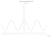
Best Fit Schemas
Each data set definition can also specify a Best Fit line to be drawn. In the examples below the data sets are tiny and the symbols are coloured white to hide them in the background canvas, they really just define the extent of the axes to show case overlaying a Best Fit.
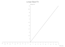
Linear
y = gradient * x + y_intercept
Some(Linear(gradient: 1.0, y_intercept: 0.0, colour: Black))
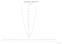
Quadratic
y = intercept + (linear_coeff * x) + (quadratic_coeff * x.powf(2))
Some(Quadratic(intercept: 1.0, linear_coeff: 0.0, quadratic_coeff: 1.0, colour: Black))
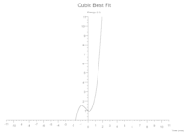
Cubic
y = intercept + (linear_coeff * x) + (quadratic_coeff * x.powf(2)) + + (cubic_coeff * x.powf(3))
Some(Cubic(intercept: 1.0, linear_coeff: -0.5, quadratic_coeff: 1.0, cubic_coeff: 1.0, colour: Black))
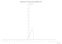
Generic Polynomial
For custom polynomials you supply a map of coefficients where each key is the nth power x will be raised by and the value is the coefficient it'll be multiplied by.
Roughly:
for (k, v) in coefficients.iter() {
	y += v * x.powf(k);
}
The following extends the Cubic best fit into a Quartic Polynomial:
Some(GenericPolynomial(coefficients: {0: 1.0, 1: 1.0, 2: 1.0, 3: 1.0, 4: -1.0}, colour: Black))
Which to the human eye kinda looks like: 1 + x + x^2 + x^3 - x^4.
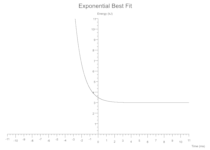
Exponential
y = (constant * base.powf(power * x)) + vertical_shift;
Some(Exponential(constant: 0.5, base: 2.7, power: -1.0, vertical_shift: 3.0, colour: Black))
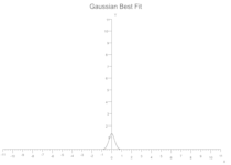
Gaussian
`y = (variance * (2.0 * PI).sqrt()).powf(-1.0) * E.powf(-(x - expected_value).powf(2.0) / (2.0 * variance.powf(2.0)))`
Some(Gaussian(expected_value: 0.0, variance: 0.3, colour: Black))
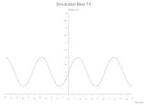
Sinusoidal
y = amplitude * ((period * x) + phase_shift).sin() + vertical_shift;
Some(Sine(amplitude: 2.0, period: 1.0, phase_shift: 0.0, vertical_shift: 3.0, colour: Black))
Cosinusoidal
y = amplitude * ((period * x) + phase_shift).cos() + vertical_shift;
Some(Cosine(amplitude: 2.0, period: 1.0, phase_shift: 0.0, vertical_shift: 3.0, colour: Black))
Examples
Simple Scatter
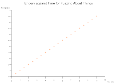
Image Size Scales Elements Dynamically
Based on the dimensions of your image (canvas_size) the text and axes positions are automatically calculated. You can also toggle a light grey background grid drawn the from axes scales.
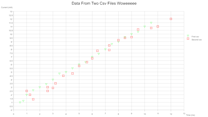
Scatter Multidata
From single or multiple csv files you can plot several data sets onto a single graph. Each data set can be configured to plot with a different colour and/or symbol. The legend can be toggled on and off. The size and thickness of the symbols are configurable on a per data set basis.
From a single csv containing multiple columns for different data sets:
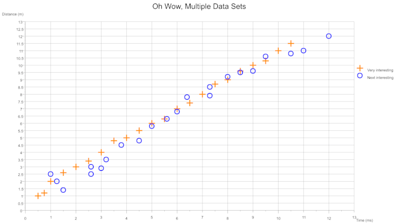
From two csv files where each contains a column pair:
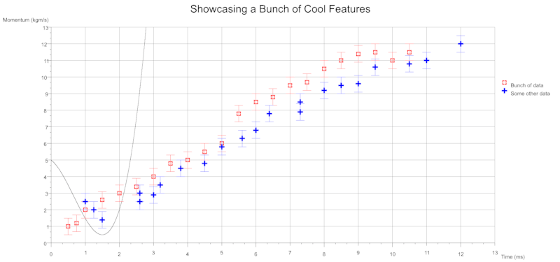
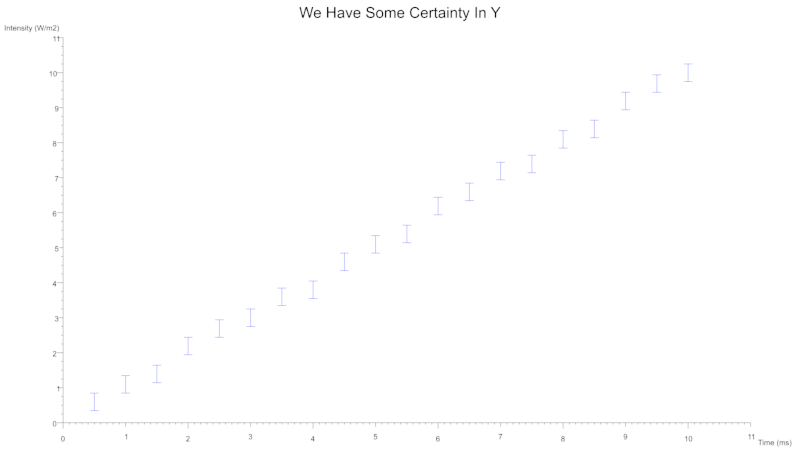
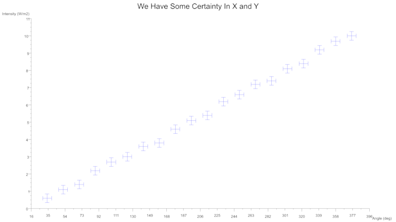
Scatter Error Bars
You can also indicate uncertainty with the use of error bars which can be specified for either axes.
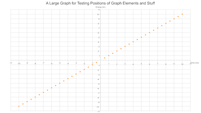
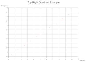
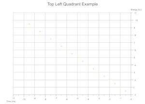
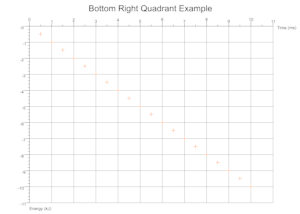
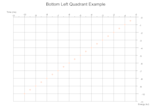
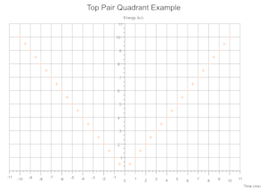
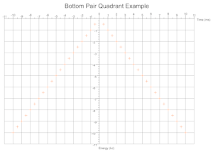
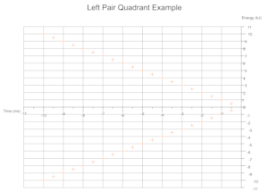
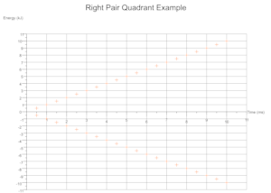
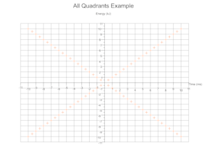
Quadrants Derived From Data
Based on the range of values across a given number of data sets the cartesian quadrants required are determined during exection with scale markings and axis labels moved appropriately.
Troubleshooting
The numbers along the axis are long floats overlapping one another
Try changing the x and y axis resolutions to numbers which are a factor of your largest values + 10%. What happens under the hood is that the largest values in your data set are found and slightly scaled so that data points avoid being plotted directly on an axis and thus obscurring some text/markers. When an axis is drawn it has a certain length in pixels and the resolution decides how many times it gets chopped up to display scale markers. To map a data value (f32) to a pixel (u32) there is a conversion where a single pixel represents some amount or length of value data. For an awkward resolution the pixel length between two scale markers could be a long float rather than rounded whole number.
E.g if the largest x value in your data is 10 try setting the x_axis_resolution to 10 * 1.1 = 11, that should produce 11 nice scale markers with whole numbers. Likewise a resolution 22 would produce nice markers also as 11 fits into 22 snugly.
The title/axis labels/legend are blurry
Try increasing the size of your canvas if the edges of the text become blurry.
Contributing
- If you're unsure about something raise an issue first
- Fork it
- Tippy tap your keyboard
- Submit a PR
LICENSE
Dual license of MIT and Apache.
TODO
- Show BestFit types in legend
- Allow overriding font
- checked sub and addition to ensure pixel u32s are not overflowing maybe?
- Split/simplify drawing methods out and then add a billion tests, many around position calculations
- What methods/modules can be reused to draw other graph types...
Dependencies
~12–22MB
~322K SLoC