3 releases (breaking)
| 0.3.0 | Apr 24, 2020 |
|---|---|
| 0.2.0 | Apr 3, 2020 |
| 0.1.0 | Mar 31, 2020 |
#200 in Visualization
455 downloads per month
Used in 2 crates
380KB
2.5K
SLoC
charts
A pure Rust visualization library inspired by D3.js.
See gallery and examples for code and more charts.
Install
You can add this as a dependency to your project in your Cargo.toml file:
[dependencies]
charts = "0.3.0"
Chart Types
The library supports the following charts (more to be added soon):
- Vertical Bar Chart
- Vertical Stacked Bar Chart
- Horizontal Bar Chart
- Horizontal Stacked Bar Chart
- Scatter Chart
- Line Chart
- Area Chart
- Histogram (TBD)
- Box Plot (TBD)
- Other (TBD)
Also, composite charts are supported (see Composite Charts below)
Building Blocks
Here are the components that allow you to create a chart:
- Scales
- Views
- Axes
- Size and Margins
- Legend
The first two are foundational components that offer a certain degree of flexibility in how data is represented and how it can be combined to achieve the desired outcome when the goal is to visualize data beyond simple forms.
Let's dive into each building block and define its structure and API, or you can go to Examples section
and see what you can build using charts.
1. Scales
A scale is an entity that transforms data from one dimension into another. The dimension you are transforming
from is called domain and the dimension you are transforming to is called range.
Currently, charts has implemented two types of scales:
- Linear Scale
- Band Scale
Linear Scale
A linear scale is an interpolation function that takes in a domain (e.g. [0, 10]) and a range (e.g. [0, 50]) and is able to transform a value from the domain into a corresponding value in the range (e.g. 5 -> 25).
When using a linear scale to create a chart, the domain represents the range of values that are
present in the dataset. For instance, if you have a simple dataset vec![123, 48, 232, 99], the
domain is represented by [48, 232] (but it can also be represented by [40, 240] or [0, 1000],
more on that in a minute).
Conversely, the range of a scale represents the diapason that is available for rendering.
For instance, if you have a chart that is 800px wide and 50px margin on the left and 50px margin
on the right (see Margins below), this means that the available range to render data is [0, 700].
Thus, if to combine the domain and the range concepts, a scale with domain[0, 10] and a
range[0, 500] will map all points from 0 to 10 onto a range of 0 to 500 pixels.
Band Scale
A band scale takes in a list of distinct domain values (e.g. categories, years) and a continuous range and interpolates the domain onto the range. It is often used in Bar Charts, where you need to map a categorical dataset onto a continuous axis of a specific size.
For instance, a band scale with domain["Apples", "Oranges", "Pears"] and a range[0, 100] will
map the "Apples" domain to 0, "Oranges" to 33.33 and "Pears" to 66.66. The actual
implementation has an inner_padding value that will leave a gap between the categories, so the real
mapped values are going to be a bit different.
2. Views
Since the same dataset can be represented in different forms, there is a concept of a View that denotes a specific representation of the data.
Since a view of the data is a representation of that data along 2 dimensions (in 2D charts), each view requires a scale for its X dimension and a scale for its Y dimension.
Here is the list of views that are available:
- VerticalBarView
- HorizontalBarView
- ScatterView
- LineSeriesView
- AreaSeriesView
3. Axes
An axis is a representation of the range of the domain that is being visualized. This means that in order to properly display an axis, it should operate with the same scale as a view does.
As a user, you will not explicitly create axes, but rather where to draw the axis (top, right, bottom, left) and what scale to use for that axis.
4. Size and Margins
When creating a chart, you can customize its layout to some degree.
You can set chart width and height as well as the margins (top, right, bottom, left). Chart margins are the padding from the chart borders that define how much space will be left for axes and other elements that are not related to a view of the data.
For instance, a chart with 800px wide and 600px tall and margins of top: 100, right: 40, bottom: 50, left: 60 will leave an area of 700px wide and 450px tall for actual data representation.
      width - 800
+-------------------------------------------------------+
|                        top                            |  h
|                        100                            |  e
|     +-------------------------------------------+     |  i
|     |                                           |     |  g
|left |                  Actual                   |right|  h
| 60  |                   Data                    | 40  |  t
|     |                   View                    |     |
|     |                700 x 450                  |     |  6
|     |                                           |     |  0
|     |                                           |     |  0
|     +-------------------------------------------+     |
|                      bottom - 50                      |
+-------------------------------------------------------+
5. Legend
The legend is automatically populated with entries present in each view
attached to a chart. In order to add a legend to a chart, use the
add_legend_at(position: AxisPosition) method on a chart instance (don't
forget to leave sufficient margin at the bottom for the legend to show up).
The dataset's key values are used as legend entry labels. In case the
dataset doesn't have any key values (i.e. when the dataset represents a
single type of data), you can specify a custom label on a View via the
.set_custom_data_label(label: String) method. Check out the
Chart Composition section example of scatter plot
with two datasets.
Examples
Below you can find examples of charts that are currently supported.
Vertical Bar Chart
Here is the sample code:
use charts::{Chart, VerticalBarView, ScaleBand, ScaleLinear};

fn main() {
    // Define chart related sizes.
    let width = 800;
    let height = 600;
    let (top, right, bottom, left) = (90, 40, 50, 60);

    // Create a band scale that maps ["A", "B", "C"] categories to values in the [0, availableWidth]
    // range (the width of the chart without the margins).
    let x = ScaleBand::new()
        .set_domain(vec![String::from("A"), String::from("B"), String::from("C")])
        .set_range(vec![0, width - left - right])
        .set_inner_padding(0.1)
        .set_outer_padding(0.1);

    // Create a linear scale that will interpolate values in [0, 100] range to corresponding
    // values in [availableHeight, 0] range (the height of the chart without the margins).
    // The [availableHeight, 0] range is inverted because SVGs coordinate system's origin is
    // in top left corner, while chart's origin is in bottom left corner, hence we need to invert
    // the range on Y axis for the chart to display as though its origin is at bottom left.
    let y = ScaleLinear::new()
        .set_domain(vec![0, 100])
        .set_range(vec![height - top - bottom, 0]);

    // You can use your own iterable as data as long as its items implement the `BarDatum` trait.
    let data = vec![("A", 90), ("B", 10), ("C", 30)];

    // Create VerticalBar view that is going to represent the data as vertical bars.
    let view = VerticalBarView::new()
        .set_x_scale(&x)
        .set_y_scale(&y)
        .load_data(&data).unwrap();

    // Generate and save the chart.
    Chart::new()
        .set_width(width)
        .set_height(height)
        .set_margins(top, right, bottom, left)
        .add_title(String::from("Bar Chart"))
        .add_view(&view)
        .add_axis_bottom(&x)
        .add_axis_left(&y)
        .add_left_axis_label("Units of Measurement")
        .add_bottom_axis_label("Categories")
        .save("vertical-bar-chart.svg").unwrap();
}
Here is the result:
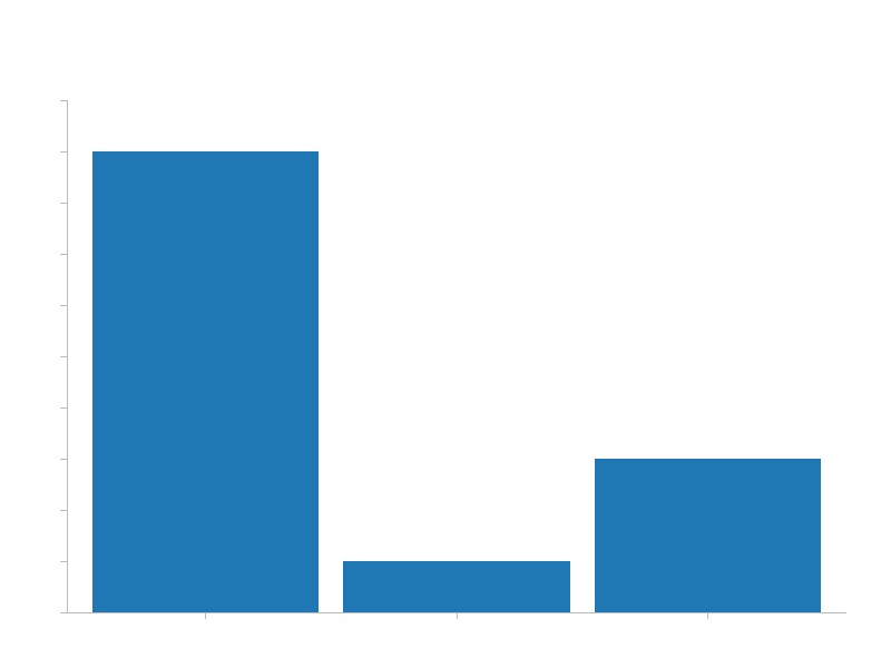
The display order of categories is defined by the vector passed to set_domain() of a ScaleBand.
If you'll switch that order to "A", "C", "B", the resulting order will adjust as well.

You can play with set_inner_padding() and set_outer_padding() values to customize the appearance of the chart.
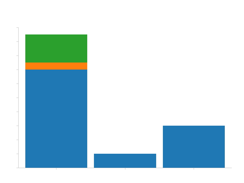
Vertical Stacked Bar Chart
A simple bar chart (as the one above) is a specific instance of a stacked bar chart where there
is only one type of values. Under the hood, charts treats both types pretty much the same,
that's why the code is almost identical, except the input data must provide a key by which to group
and stack values.
use charts::{Chart, VerticalBarView, ScaleBand, ScaleLinear, BarLabelPosition};

fn main() {
    // Define chart related sizes.
    let width = 800;
    let height = 600;
    let (top, right, bottom, left) = (90, 40, 50, 60);

    // Create a band scale that maps ["A", "B", "C"] categories to values in [0, availableWidth]
    // range (the width of the chart without the margins).
    let x = ScaleBand::new()
        .set_domain(vec![String::from("A"), String::from("B"), String::from("C")])
        .set_range(vec![0, width - left - right]);

    // Create a linear scale that will interpolate values in [0, 100] range to corresponding
    // values in [availableHeight, 0] range (the height of the chart without the margins).
    // The [availableHeight, 0] range is inverted because SVGs coordinate system's origin is
    // in the top left corner, while chart's origin is in bottom left corner, hence we need to
    // invert the range on Y axis for the chart to display as though its origin is at bottom left.
    let y = ScaleLinear::new()
        .set_domain(vec![0, 100])
        .set_range(vec![height - top - bottom, 0]);

    // You can use your own iterable as data as long as its items implement the `BarDatum` trait.
    let data = vec![("A", 70, "foo"), ("B", 10, "foo"), ("C", 30, "foo"), ("A", 20, "bar"), ("A", 5, "baz")];

    // Create VerticalBar view that is going to represent the data as vertical bars.
    let view = VerticalBarView::new()
        .set_x_scale(&x)
        .set_y_scale(&y)
        // .set_label_visibility(false)  // <-- uncomment this line to hide bar value labels
        .set_label_position(BarLabelPosition::Center)
        .load_data(&data).unwrap();

    // Generate and save the chart.
    Chart::new()
        .set_width(width)
        .set_height(height)
        .set_margins(top, right, bottom, left)
        .add_title(String::from("Stacked Bar Chart"))
        .add_view(&view)
        .add_axis_bottom(&x)
        .add_axis_left(&y)
        .add_left_axis_label("Units of Measurement")
        .add_bottom_axis_label("Categories")
        .save("stacked-vertical-bar-chart.svg").unwrap();
}
The result:
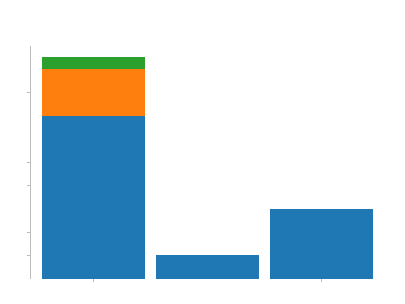
By default, the order of the keys in the input data dictates the stacking order. You can, however,
adjust that by specifying a different order using the set_keys() method on the VerticalBarDataset
struct before calling load_data():
// Create VerticalBar view that is going to represent the data as vertical bars.
let view = VerticalBarView::new()
    .set_x_scale(&x)
    .set_y_scale(&y)
    .set_keys(vec![String::from("foo"), String::from("baz"), String::from("bar")])
    // .set_label_visibility(false)  // <-- uncomment this line to hide bar value labels
    .set_label_position(BarLabelPosition::Center)
    .load_data(&data).unwrap();
The result of that is as follows (notice the order in the first bar has changed):
Scatter Plot
use charts::{Chart, ScaleLinear, ScatterView, MarkerType, PointLabelPosition};

fn main() {
    // Define chart related sizes.
    let width = 800;
    let height = 600;
    let (top, right, bottom, left) = (90, 40, 50, 60);

    // Create a band scale that will interpolate values in [0, 200] to values in the
    // [0, availableWidth] range (the width of the chart without the margins).
    let x = ScaleLinear::new()
        .set_domain(vec![0, 200])
        .set_range(vec![0, width - left - right]);

    // Create a linear scale that will interpolate values in [0, 100] range to corresponding
    // values in [availableHeight, 0] range (the height of the chart without the margins).
    // The [availableHeight, 0] range is inverted because SVGs coordinate system's origin is
    // in top left corner, while chart's origin is in bottom left corner, hence we need to invert
    // the range on Y axis for the chart to display as though its origin is at bottom left.
    let y = ScaleLinear::new()
        .set_domain(vec![0, 100])
        .set_range(vec![height - top - bottom, 0]);

    // You can use your own iterable as data as long as its items implement the `PointDatum` trait.
    let scatter_data = vec![(120, 90), (12, 54), (100, 40), (180, 10)];

    // Create Scatter view that is going to represent the data as points.
    let scatter_view = ScatterView::new()
        .set_x_scale(&x)
        .set_y_scale(&y)
        .set_label_position(PointLabelPosition::E)
        .set_marker_type(MarkerType::Square)
        .load_data(&scatter_data).unwrap();

    // Generate and save the chart.
    Chart::new()
        .set_width(width)
        .set_height(height)
        .set_margins(top, right, bottom, left)
        .add_title(String::from("Scatter Chart"))
        .add_view(&scatter_view)
        .add_axis_bottom(&x)
        .add_axis_left(&y)
        .add_left_axis_label("Custom X Axis Label")
        .add_bottom_axis_label("Custom Y Axis Label")
        .save("scatter-chart.svg").unwrap();
}
The result:

You can customize the appearance and layout as follows:
Choose how labels should display relative to the mark. Available options: N, NE, E, SE, S, SW, W, NW
Choose the mark type for the points. Available options: Square, Circle, X
If the dataset has a key which differentiates the points you can also use a ScatterView to display
it.
use charts::{Chart, ScaleLinear, ScatterView, MarkerType, Color, PointLabelPosition};

fn main() {
    // Define chart related sizes.
    let width = 800;
    let height = 600;
    let (top, right, bottom, left) = (90, 40, 50, 60);

    // Create a band scale that will interpolate values in [0, 200] to values in the
    // [0, availableWidth] range (the width of the chart without the margins).
    let x = ScaleLinear::new()
        .set_domain(vec![0, 200])
        .set_range(vec![0, width - left - right]);

    // Create a linear scale that will interpolate values in [0, 100] range to corresponding
    // values in [availableHeight, 0] range (the height of the chart without the margins).
    // The [availableHeight, 0] range is inverted because SVGs coordinate system's origin is
    // in top left corner, while chart's origin is in bottom left corner, hence we need to invert
    // the range on Y axis for the chart to display as though its origin is at bottom left.
    let y = ScaleLinear::new()
        .set_domain(vec![0, 100])
        .set_range(vec![height - top - bottom, 0]);

    // You can use your own iterable as data as long as its items implement the `PointDatum` trait.
    let scatter_data = vec![(120, 90, "foo"), (12, 54, "foo"), (100, 40, "bar"), (180, 10, "baz")];

    // Create Scatter view that is going to represent the data as points.
    let scatter_view = ScatterView::new()
        .set_x_scale(&x)
        .set_y_scale(&y)
        .set_label_position(PointLabelPosition::E)
        .set_marker_type(MarkerType::Circle)
        .set_colors(Color::color_scheme_dark())
        .load_data(&scatter_data).unwrap();

    // Generate and save the chart.
    Chart::new()
        .set_width(width)
        .set_height(height)
        .set_margins(top, right, bottom, left)
        .add_title(String::from("Scatter Chart"))
        .add_view(&scatter_view)
        .add_axis_bottom(&x)
        .add_axis_left(&y)
        .add_left_axis_label("Custom X Axis Label")
        .add_bottom_axis_label("Custom Y Axis Label")
        .save("scatter-chart-multiple-keys.svg").unwrap();
}
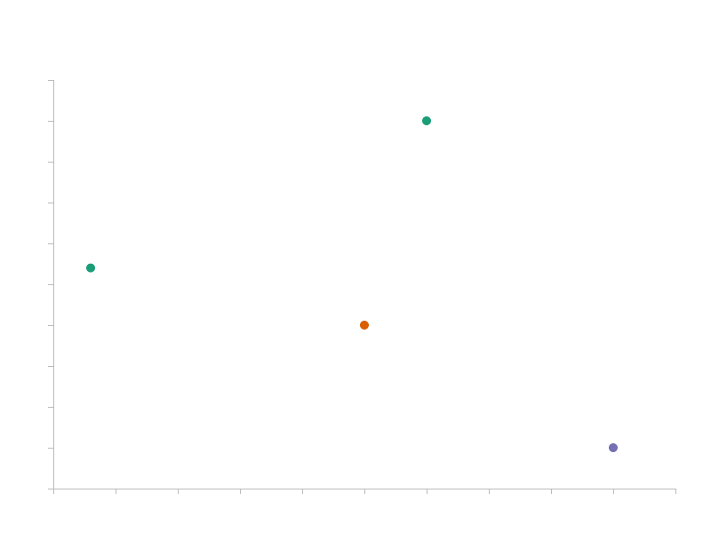
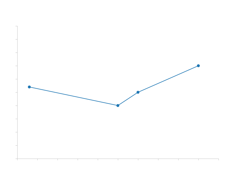
Line Series
Line series supports the same functionality os a Scatter plot.
use charts::{Chart, ScaleLinear, MarkerType, PointLabelPosition, LineSeriesView};

fn main() {
    // Define chart related sizes.
    let width = 800;
    let height = 600;
    let (top, right, bottom, left) = (90, 40, 50, 60);

    // Create a band scale that will interpolate values in [0, 200] to values in the
    // [0, availableWidth] range (the width of the chart without the margins).
    let x = ScaleLinear::new()
        .set_domain(vec![0_f32, 200_f32])
        .set_range(vec![0, width - left - right]);

    // Create a linear scale that will interpolate values in [0, 100] range to corresponding
    // values in [availableHeight, 0] range (the height of the chart without the margins).
    // The [availableHeight, 0] range is inverted because SVGs coordinate system's origin is
    // in top left corner, while chart's origin is in bottom left corner, hence we need to invert
    // the range on Y axis for the chart to display as though its origin is at bottom left.
    let y = ScaleLinear::new()
        .set_domain(vec![0_f32, 100_f32])
        .set_range(vec![height - top - bottom, 0]);

    // You can use your own iterable as data as long as its items implement the `PointDatum` trait.
    let line_data = vec![(12, 54), (100, 40), (120, 50), (180, 70)];

    // Create Line series view that is going to represent the data.
    let line_view = LineSeriesView::new()
        .set_x_scale(&x)
        .set_y_scale(&y)
        .set_marker_type(MarkerType::Circle)
        .set_label_position(PointLabelPosition::N)
        .load_data(&line_data).unwrap();

    // Generate and save the chart.
    Chart::new()
        .set_width(width)
        .set_height(height)
        .set_margins(top, right, bottom, left)
        .add_title(String::from("Line Chart"))
        .add_view(&line_view)
        .add_axis_bottom(&x)
        .add_axis_left(&y)
        .add_left_axis_label("Custom Y Axis Label")
        .add_bottom_axis_label("Custom X Axis Label")
        .save("line-chart.svg").unwrap();
}
Area Series
Currently, AreaSeriesView doesn't support datasets with multiple keys, thus it cannot display a stacked area chart.
use charts::{Chart, ScaleLinear, MarkerType, PointLabelPosition, AreaSeriesView};

fn main() {
    // Define chart related sizes.
    let width = 800;
    let height = 600;
    let (top, right, bottom, left) = (90, 40, 50, 60);

    // Create a band scale that will interpolate values in [0, 200] to values in the
    // [0, availableWidth] range (the width of the chart without the margins).
    let x = ScaleLinear::new()
        .set_domain(vec![12_f32, 180_f32])
        .set_range(vec![0, width - left - right]);

    // Create a linear scale that will interpolate values in [0, 100] range to corresponding
    // values in [availableHeight, 0] range (the height of the chart without the margins).
    // The [availableHeight, 0] range is inverted because SVGs coordinate system's origin is
    // in top left corner, while chart's origin is in bottom left corner, hence we need to invert
    // the range on Y axis for the chart to display as though its origin is at bottom left.
    let y = ScaleLinear::new()
        .set_domain(vec![0_f32, 100_f32])
        .set_range(vec![height - top - bottom, 0]);

    // You can use your own iterable as data as long as its items implement the `PointDatum` trait.
    let area_data = vec![(12, 54), (100, 40), (120, 50), (180, 70)];

    // Create Area series view that is going to represent the data.
    let area_view = AreaSeriesView::new()
        .set_x_scale(&x)
        .set_y_scale(&y)
        .set_marker_type(MarkerType::Circle)
        .set_label_position(PointLabelPosition::N)
        .load_data(&area_data).unwrap();

    // Generate and save the chart.
    Chart::new()
        .set_width(width)
        .set_height(height)
        .set_margins(top, right, bottom, left)
        .add_title(String::from("Area Chart"))
        .add_view(&area_view)
        .add_axis_bottom(&x)
        .add_axis_left(&y)
        .add_left_axis_label("Custom Y Axis Label")
        .add_bottom_axis_label("Custom X Axis Label")
        .save("area-chart.svg").unwrap();
}

Chart Composition
Once you understand the basic building blocks (mainly Scales and Views), the sky is the limit
(and available implemented views, for now (: ) on what you can achieve using charts.
The main idea is to use common scale instances that serve as a common context between different datasets and views.
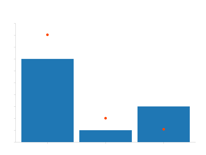
One example is combining a bar chart and a scatter plot:
use charts::{Chart, VerticalBarView, ScaleBand, ScaleLinear, ScatterView, MarkerType, Color, PointLabelPosition};

fn main() {
    // Define chart related sizes.
    let width = 800;
    let height = 600;
    let (top, right, bottom, left) = (90, 40, 50, 60);

    // Create a band scale that maps ["A", "B", "C"] categories to values in the [0, availableWidth]
    // range (the width of the chart without the margins).
    let x = ScaleBand::new()
        .set_domain(vec![String::from("A"), String::from("B"), String::from("C")])
        .set_range(vec![0, width - left - right]);

    // Create a linear scale that will interpolate values in [0, 100] range to corresponding
    // values in [availableHeight, 0] range (the height of the chart without the margins).
    // The [availableHeight, 0] range is inverted because SVGs coordinate system's origin is
    // in top left corner, while chart's origin is in bottom left corner, hence we need to invert
    // the range on Y axis for the chart to display as though its origin is at bottom left.
    let y = ScaleLinear::new()
        .set_domain(vec![0, 100])
        .set_range(vec![height - top - bottom, 0]);

    // You can use your own iterable as data as long as its items implement the `BarDatum` trait.
    let bar_data = vec![("A", 70), ("B", 10), ("C", 30)];

    // You can use your own iterable as data as long as its items implement the `PointDatum` trait.
    let scatter_data = vec![(String::from("A"), 90.3), (String::from("B"), 20.1), (String::from("C"), 10.8)];

    // Create VerticalBar view that is going to represent the data as vertical bars.
    let bar_view = VerticalBarView::new()
        .set_x_scale(&x)
        .set_y_scale(&y)
        .load_data(&bar_data).unwrap();

    // Create Scatter view that is going to represent the data as points.
    let scatter_view = ScatterView::new()
        .set_x_scale(&x)
        .set_y_scale(&y)
        .set_label_position(PointLabelPosition::NE)
        .set_marker_type(MarkerType::Circle)
        .set_colors(Color::from_vec_of_hex_strings(vec!["#FF4700"]))
        .load_data(&scatter_data).unwrap();

    // Generate and save the chart.
    Chart::new()
        .set_width(width)
        .set_height(height)
        .set_margins(top, right, bottom, left)
        .add_title(String::from("Composite Bar + Scatter Chart"))
        .add_view(&bar_view)                            // <-- add bar view
        .add_view(&scatter_view)                        // <-- add scatter view
        .add_axis_bottom(&x)
        .add_axis_left(&y)
        .add_left_axis_label("Units of Measurement")
        .add_bottom_axis_label("Categories")
        .save("composite-bar-and-scatter-chart.svg").unwrap();
}
The result looks as follows:
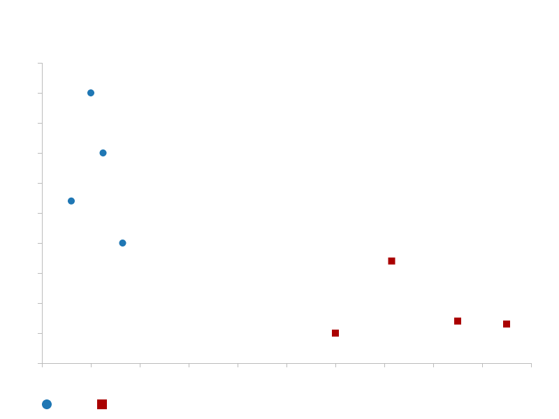
Another example is combining different datasets. For instance, we can define scales that cover the domain from both datasets and see how they relate to each other.
use charts::{Chart, ScaleLinear, ScatterView, MarkerType, PointLabelPosition, Color, AxisPosition};

fn main() {
    // Define chart related sizes.
    let width = 800;
    let height = 600;
    let (top, right, bottom, left) = (90, 40, 80, 60);

    // Create a band scale that will interpolate values in [0, 200] to values in the
    // [0, availableWidth] range (the width of the chart without the margins).
    let x = ScaleLinear::new()
        .set_domain(vec![0_f32, 200_f32])
        .set_range(vec![0, width - left - right]);

    // Create a linear scale that will interpolate values in [0, 100] range to corresponding
    // values in [availableHeight, 0] range (the height of the chart without the margins).
    // The [availableHeight, 0] range is inverted because SVGs coordinate system's origin is
    // in top left corner, while chart's origin is in bottom left corner, hence we need to invert
    // the range on Y axis for the chart to display as though its origin is at bottom left.
    let y = ScaleLinear::new()
        .set_domain(vec![0_f32, 100_f32])
        .set_range(vec![height - top - bottom, 0]);

    // You can use your own iterable as data as long as its items implement the `PointDatum` trait.
    let scatter_data_1 = vec![(20, 90), (12, 54), (25, 70), (33, 40)];
    let scatter_data_2 = vec![(120, 10), (143, 34), (170, 14), (190, 13)];

    // Create Scatter view that is going to represent the data as points.
    let scatter_view_1 = ScatterView::new()
        .set_x_scale(&x)
        .set_y_scale(&y)
        .set_marker_type(MarkerType::Circle)
        .set_label_position(PointLabelPosition::N)
        .set_custom_data_label("Apples".to_owned())
        .load_data(&scatter_data_1).unwrap();

    // Create Scatter view that is going to represent the data as points.
    let scatter_view_2 = ScatterView::new()
        .set_x_scale(&x)
        .set_y_scale(&y)
        .set_marker_type(MarkerType::Square)
        .set_label_position(PointLabelPosition::N)
        .set_custom_data_label("Oranges".to_owned())
        .set_colors(Color::from_vec_of_hex_strings(vec!["#aa0000"]))
        .load_data(&scatter_data_2).unwrap();

    // Generate and save the chart.
    Chart::new()
        .set_width(width)
        .set_height(height)
        .set_margins(top, right, bottom, left)
        .add_title(String::from("Scatter Chart"))
        .add_view(&scatter_view_1)
        .add_view(&scatter_view_2)
        .add_axis_bottom(&x)
        .add_axis_left(&y)
        .add_left_axis_label("Custom X Axis Label")
        .add_bottom_axis_label("Custom Y Axis Label")
        .add_legend_at(AxisPosition::Bottom)
        .save("scatter-chart-two-datasets.svg").unwrap();
}
Next Steps
This is still a work in progress, so the next steps are going to be implementing more views and improving on existing functionality.
Dependencies
~2.3–3.5MB
~57K SLoC