2 unstable releases
| 0.1.0 | Dec 13, 2019 |
|---|---|
| 0.0.1 | Dec 13, 2019 |
#806 in Web programming
48 downloads per month
78KB
2.5K
SLoC
block_kit
Simple wrapper for Slack API, Block Kit and Payloads for Slach Commands and Interactive Components. Implemented using serde
other samples
Basic
1. load env
// export SLACK_BOT_TOKEN=xoxb-your-bot-token
// export SLACK_CHANNEL=random
let config = match from_env::<SlackConfig>() {
     Ok(val) => val,
     Err(err) => {
         error!("{}", err);
         process::exit(1);
     }
 };
2. setup block payload
let section = SectionBlock::new(Markdown("@here *Hello World*, `section1`".into()));
let common_payload = CommonMessagePayload::new().blocks(vec![section.into()]);
let payload = ChatPostMessagePayload::new(&config.channel, common_payload);
3. POST.
Sample with reqwest
let res: PostMessageResponse = reqwest::Client::new()
    .post(CHAT_POST_MESSAGE_URL)
    .header("Authorization", format!("Bearer {}", config.bot_token))
    .json(&payload)
    .send()
    .await
    .unwrap()
    .json()
    .await
    .unwrap();
Block Kit
-
Block Kit is a UI framework for Slack apps that offers a balance of control and flexibility when building experiences in messages and other surfaces.
-
Customize the order and appearance of information and guide users through your app's capabilities by composing, updating, sequencing, and stacking blocks — reusable components that work almost everywhere in Slack.
Quoted from official docs
Structure Overview
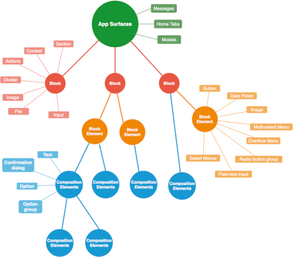
App Surface is anywhere an app can express itself throught communication or interaction. It may have some Blocks.
Block is a visual component. Blocks can be stacked and arranged to create layouts. The essential Block Kit building experience is the same in any surfaces.
Block may have some Block Elements and some Composition Objects. The number of elements it can have depends on the type of block. For example,
[Block Elements]
- Section: up to 1.
- Divider: cannot have.
- Actions: up to 5.
[Composition Objects]
- Section: some Texts in
textandfields. - Divider: cannot have.
Block Element is a visual smaller component.
Elements can be used inside of section, context, actioons block.
They constitutes a part of Block. Element may have some Composition Objects.
Composition Object is also a visual component, but is smaller than Block Element. It can be used inside of blocks and block elements. And, it may have some Composition Objects.
For example,
- Confirmation dialog: some Text object.
- Option: 1 Text object.
- Option group: 1 Text object and some option objects up to 100.
Some sentences are referred by official docs
Supported Surfaces
- Messages
- Home tab
- Modals
view payloads, Home Tab and Modals, haven't been supported yet, but will be soon.
Supported Blocks
- Section
- Context
- Actions
- Divider
- Image
- File
- Input
Supported Block Elements
- Button
- Date Picker
- Image
- Multi-select Menu
- Overflow Menu
- Plain-text Input
- Radio button group
- Select Menus
Supported Composition Objects
- Text
- Confirmation dialog
- Option
- Option group
static linking
As described in rust-musl-builder.
alias rust-musl-builder='docker run --rm -it -v "$(pwd)":/home/rust/src ekidd/rust-musl-builder'
rust-musl-builder cargo build --example interactive_server --release
Dependencies
~0.3–0.9MB
~20K SLoC