5 releases
| 0.0.8 | Aug 25, 2024 |
|---|---|
| 0.0.7 | Aug 19, 2024 |
#243 in Development tools
66KB
1K
SLoC
Yew Google Material
yew-google-material = "0.0.8"
Please, open new issue on github if you notice any error or mistake!
yew-google-material is a very simple crate to use some of google materials and https://fonts.google.com/
Unfortunately a lot of crates with materials, icons for yew framework are depricated and use depricated javascript code.
Here I use only Rust code to add some design features for yew.
Now only buttons, text fields and icons are available.
Buttons and text fields are not the same as one in google material web, but very similar to them.
Icons
To use icons from https://fonts.google.com/icons you need to add some html inside
<head></head>
There are three types of icons. Add this if you want to use Outlined style of icons:
<link rel="stylesheet" href="https://fonts.googleapis.com/css2?family=Material+Symbols+Outlined:opsz,wght,FILL,GRAD@20..48,100..700,0..1,-50..200" />
To use Rounded style of icons:
<link rel="stylesheet" href="https://fonts.googleapis.com/css2?family=Material+Symbols+Rounded:opsz,wght,FILL,GRAD@20..48,100..700,0..1,-50..200" />
To use Sharp style of icons:
<link rel="stylesheet" href="https://fonts.googleapis.com/css2?family=Material+Symbols+Sharp:opsz,wght,FILL,GRAD@20..48,100..700,0..1,-50..200" />
Then choose on of the icons in the catalog of https://fonts.google.com/icons, i.e. 'search', 'star', 'menu', etc. and see example below.
Examples
<link rel="stylesheet" href="https://fonts.googleapis.com/css2?family=Material+Symbols+Outlined:opsz,wght,FILL,GRAD@20..48,100..700,0..1,-50..200" />
use yew::prelude::*;
use yew_google_material::prelude::*;

<GIcon
    size="16px"
    transition="all 0.2s"
    icon="search"
    icon_style={GIconStyle::Outlined}
    fill=true
    wght="200"
    grade="0"
    opsz="24"
    color="#fff"
/>
Note, you that you can animate icon attributes with transition. The default value is "unset", but for animation it is recomended to set "all 0.2s" or as you wish.
Or you can add an icon with default options:
<link rel="stylesheet" href="https://fonts.googleapis.com/css2?family=Material+Symbols+Outlined:opsz,wght,FILL,GRAD@20..48,100..700,0..1,-50..200" />
use yew::prelude::*;
use yew_google_material::prelude::*;

<GIcon
    icon="star"
    icon_style={GIconStyle::Outlined}
/>
Buttons
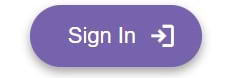
GButtonStyle::Elevated styled button with trailing icon
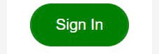
GButtonStyle::Filled styled button
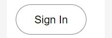
GButtonStyle::Outlined styled button
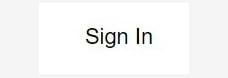
GButtonStyle::Text styled button
GButtonStyle::Filled styled icon button
The key size attribute of button is font_size attribute. It bonds a lot of other sizes and has the default value 14px.
GButton has a lot of attributes (and you can make something similar to FAB button via them), but only id are required.
Attention! You must set label and/or use icon to make your button readable!
Examples
use yew::prelude::*;
use yew_google_material::prelude::*;

<GButton
id="use_g_button"
label="Button" />
Also you can add icon with has_icon attribute. If so, you also need to set icon_style attribute together with stylesheet inside <head></head>(see GIcon docs). If you need trailing icon use trailing_icon with true together with has_icon attributes in GButton.
To adjust icon parameters use fill, wght, grade, opsz attributes as well as with GIcon.
Attention! The way to add icon in this version is different from v.0.0.7.
use yew::prelude::*;
use yew_google_material::prelude::*;

<GButton
id="login_button"  // requiered
label="Sign In"
style={GButtonStyle::Outlined}
label_color="#fff"
has_icon="login"                     // requiered to add icon
trailing_icon=true
icon_style={GIconStyle::Outlined}    // requiered to add icon
wght="400"                           // add it only for icon if you need it
/>
Attention! If you change icon size within button you can break the design. Probably then you need to adjust width and height. Do it with caution.
TextFields
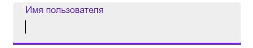
Simple text input with GInputStyle::Filled style
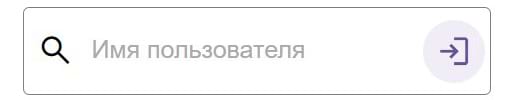
GInputStyle::Outlined slyled input with leading icon and trailing button icon
The key size attribute of input field is font_size. It bonds a lot of other sizes of text field and has the default value 16px.
GTextInput has a lot of attributes, but only id, onchange and label are required. Label here has the same role as placeholder. If you do not need label, add it with empty double quotes.
See the describtion of this attributes here: https://material-web.dev/components/text-field/#api
Examples
use yew::prelude::*;
use yew_google_material::prelude::*;

let onchange_username = Callback::from(|username: AttrValue| {Msg::InputUsername(username)});

<GTextInput
id="username_text_login_name"
onchange={onchange_username}
label="Имя пользователя" />
Also you can add leading and trailing GIcons, change style, change Event to InputEvent and do many other things via attributes in this way:
use yew::prelude::*;
use yew_google_material::prelude::*;

let search_input = Callback::from(|search_input: AttrValue| {Msg::Search(search_input)});

<GTextInput
    id="username_text_login_name"
    event={GInputEvent::OnInput}
    oninput={search_input}
    has_leading_icon=true
    has_trailing_icon=true
    input_type="text"
    supporting_text="text"
    label="Введите поисковый запрос" >
    <GIcon
       icon="search"
       leading_icon=true
       icon_style={GIconStyle::Outlined}
    />
    <GIcon
       icon="cancel"
       trailing_icon=true
       icon_style={GIconStyle::Outlined}
    />
</GTextInput>
If you need to add trailing button icon inside input field, instead of GIcon use GButton inside <GTextInput></GTextInput> with attributes:
has_icon (icon name from fonts.google.com/icons), trailing_icon (true), parent (DependsOn::GTextInput), icon_style (Outlined, Rounded or Sharp)
Do not use label attribute for GButton inside GTextInput!
use yew::prelude::*;
use yew_google_material::prelude::*;

let username_input = Callback::from(|username_input: AttrValue| {Msg::Username(username_input)});

<GTextInput
    id="username_text_login_name"
    onchange={username_input}
    input_type="text"
    has_trailing_icon=true
    supporting_text="text"
    label="Введите поисковый запрос" >
    <GButton
        id="login_button"
        button_type="button"
        parent={DependsOn::GTextInput}      // required inside GTextInput
        style={GButtonStyle::Outlined}      // required for icon inside GButton
        label_color="#6750A4"
        has_icon="login"                    // required for icon inside GButton
        trailing_icon=true
        icon_style={GIconStyle::Outlined}   // required for icon inside GButton
    />
</GTextInput>
If you need leading button icon element inside GTextInput, just remove trailing_icon attribute from GButton, add has_leading_icon=true for GTextInput and remove has_trailing_icon=true.
Attentin! It is recomended to use button_type attribute with "button", or your button will be on its own inside <form></form> element.
Versions
0.0.8
- Now you can add icon button inside GTextInput.
- Design of icon inside button was rewritten.
- GTextInput margin fixed.
0.0.7
- ReadMe fixed
0.0.5
- GButton added
- GTextInput height attribute added
- Many of GTextInput attributes were renamed
- GIcon size adjustment in GTextInput fixed
0.0.4
- GTextInput added
0.0.3
- Only icons available, ReadMe fixed
Dependencies
~12–21MB
~293K SLoC