32 releases (13 breaking)
| 0.14.0-beta2 | Jan 5, 2025 |
|---|---|
| 0.13.1 | Oct 31, 2024 |
| 0.10.2 | Jun 7, 2024 |
| 0.9.1 | Feb 28, 2024 |
| 0.3.2 | Jul 21, 2023 |
#115 in GUI
547 downloads per month
670KB
2K
SLoC
Leptos Struct Table
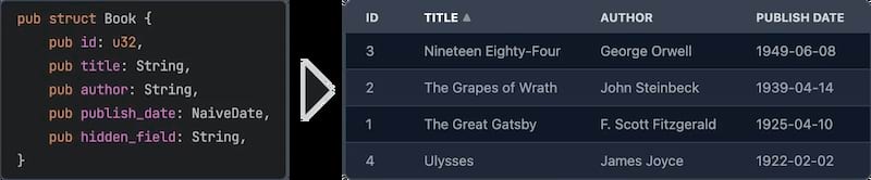
Easily create Leptos table components from structs.
Features
- Easy to use - yet powerful.
- Async data loading - The data is loaded asynchronously. This allows to load data from a REST API or a database etc.
- Selection - Can be turned off or single/multi select
- Customization - You can customize every aspect of the table by plugging in your own components for rendering rows, cells, headers. See Custom Renderers for more information.
- Headless - No default styling is applied to the table. You can fully customize the classes that are applied to the table. See Classes customization for more information.
- Sorting - Optional. If turned on: Click on a column header to sort the table by that column. You can even sort by multiple columns.
- Virtualization - Only the visible rows are rendered. This allows for very large tables.
- Pagination - Instead of virtualization you can paginate the table.
- Caching - Only visible rows are loaded and cached.
- Editing - Optional. You can provide custom renderers for editable cells. See Editable Cells for more information.
Usage
use leptos::prelude::*;
use leptos_struct_table::*;

#[derive(TableRow, Clone)]
#[table(impl_vec_data_provider)]
pub struct Person {
    id: u32,
    name: String,
    age: u32,
}

#[component]
fn Demo() -> impl IntoView {
    let rows = vec![
        Person { id: 1, name: "John".to_string(), age: 32 },
        Person { id: 2, name: "Jane".to_string(), age: 28 },
        Person { id: 3, name: "Bob".to_string(), age: 45 },
    ];

    view! {
        <table>
            <TableContent rows scroll_container="html" />
        </table>
    }
}
Server-Side Rendering
To use this with Leptos' server-side rendering, you can have to add leptos-use as a dependency to your Cargo.toml and
then configure it for SSR like the following.
[dependencies]
leptos-use = "<current version>"
# ...

[features]
hydrate = [
    "leptos/hydrate",
    # ...
]
ssr = [
    "leptos/ssr",
    # ...
    "leptos-use/ssr",
]
Please see the serverfn_sqlx example for a working project with SSR.
Data Providers
As shown in the inital usage example, when you add #[table(impl_vec_data_provider)] to your struct,
the table will automatically generate a data provider for you. You can then directly pass a Vec<T> to the rows prop.
Internally this implements the trait TableDataProvider for Vec<T>.
To leverage the full power of async partial data loading with caching you should implement the trait
PaginatedTableDataProvider or the trait TableDataProvider yourself. It's quite easy to do so.
Which of the two traits you choose depends on your data source. If your data source provides
paginated data, as is the case for many REST APIs, you should implement PaginatedTableDataProvider.
Otherwise you should probably implement TableDataProvider.
See the paginated_rest_datasource example and the serverfn_sqlx example for working demo projects that implement these traits.
Macro options
The #[table(...)] attribute can be used to customize the generated component. The following options are available:
Struct attributes
These attributes can be applied to the struct itself.
-
sortable- Specifies that the table should be sortable. This makes the header titles clickable to control sorting. You can specify two sorting modes with the propsorting_modeon theTableContentcomponent:sorting_mode=SortingMode::MultiColumn(the default) allows the table to be sorted by multiple columns ordered by priority.sorting_mode=SortingMode::SingleColumn"allows the table to be sorted by a single column. Clicking on another column will simply replace the sorting column.
See the simple example and the selectable example for more information.
-
classes_provider- Specifies the name of the class provider. Used to quickly customize all of the classes that are applied to the table. For convenience sensible presets for major CSS frameworks are provided. SeeTableClassesProviderand tailwind example for more information. -
head_cell_renderer- Specifies the name of the header cell renderer component. Used to customize the rendering of header cells. Defaults toDefaultTableHeaderRenderer. See the custom_renderers_svg example for more information. -
impl_vec_data_provider- If given, thenTableDataProvideris automatically implemented forVec<ThisStruct>to allow for easy local data use. See the simple example for more information. -
row_type- Specifies the type of the rows in the table. Defaults to the struct that this is applied to. See the custom_type example for more information.
Field attributes
These attributes can be applied to any field in the struct.
class- Specifies the classes that are applied to each cell (head and body) in the field's column. Can be used in conjuction withclasses_providerto customize the classes.head_class- Specifies the classes that are applied to the header cell in the field's column. Can be used in conjuction withclasses_providerto customize the classes.cell_class- Specifies the classes that are applied to the body cells in the field's column. Can be used in conjuction withclasses_providerto customize the classes.skip- Specifies that the field should be skipped. This is useful for fields that are not displayed in the table.skip_sort- Only applies ifsortableis set on the struct. Specifies that the field should not be used for sorting. Clicking it's header will not do anything.skip_header- Makes the title of the field not be displayed in the head row.title- Specifies the title that is displayed in the header cell. Defaults to the field name converted to title case (this_fieldbecomes"This Field").renderer- Specifies the name of the cell renderer component. Used to customize the rendering of cells. Defaults toDefaultTableCellRenderer.format- Quick way to customize the formatting of cells without having to create a custom renderer. See Formatting below for more information.getter- Specifies a method that returns the value of the field instead of accessing the field directly when rendering.none_value- Specifies a display value forOptiontypes when they areNone. Defaults to empty string
Formatting
The format attribute can be used to customize the formatting of cells. It is an easier alternative to creating a custom renderer when you just want to customize some basic formatting.
It is type safe and tied to the type the formatting is applied on. see CellValue and the associated type for the type you are rendering to see a list of options
See:
Features
chrono- Adds support for types from the cratechrono.rust_decimal- Adds support for types from the craterust_decimal.time- Adds support for types from the cratetime.uuid- Adds support for types from the crateuuid.
Classes Customization
Classes can be easily customized by using the classes_provider attribute on the struct.
You can specify any type that implementats the trait TableClassesProvider. Please see the documentation for that trait for more information.
You can also look at TailwindClassesPreset for an example how this can be implemented.
Example:
#[derive(TableRow, Clone)]
#[table(classes_provider = "TailwindClassesPreset")]
pub struct Book {
    id: u32,
    title: String,
}
Field Getters
Sometimes you want to display a field that is not part of the struct but a derived value either
from other fields or sth entirely different. For this you can use either the FieldGetter type
or the getter attribute.
Let's start with FieldGetter and see an example:
#[derive(TableRow, Clone)]
#[table(classes_provider = "TailwindClassesPreset")]
pub struct Book {
    id: u32,
    title: String,
    author: String,

    // this tells the macro that you're going to provide a method called `title_and_author` that returns a `String`
    title_and_author: FieldGetter<String>
}

impl Book {
    // Returns the value that is displayed in the column
    pub fn title_and_author(&self) -> String {
        format!("{} by {}", self.title, self.author)
    }
}
To provide maximum flexibility you can use the getter attribute.
#[derive(TableRow, Clone)]
#[table(classes_provider = "TailwindClassesPreset")]
pub struct Book {
    // this tells the macro that you're going to provide a method called `get_title` that returns a `String`
    #[table(getter = "get_title")]
    title: String,
}

impl Book {
    pub fn get_title(&self) -> String {
        format!("Title: {}", self.title)
    }
}
When to use FieldGetter vs getter attribute
A field of type FieldGetter<T> is a virtual field that doesn't really exist on the struct.
Internally FieldGetter is just a new-typed PhatomData and thus is removed during compilation.
Hence it doesn't increase memory usage. That means you should use it for purely derived data.
The getter attribute should be used on a field that actually exists on the struct but whose
value you want to modify before it's rendered.
Custom Renderers
Custom renderers can be used to customize almost every aspect of the table.
They are specified by using the various ...renderer attributes on the struct or fields or props of the TableContent component.
To implement a custom renderer please have a look at the default renderers listed below.
On the struct level you can use this attribute:
thead_cell_renderer- Defaults toDefaultTableHeaderCellRendererwhich renders<th><span>Title</span></th>together with sorting functionality (if enabled).
As props of the TableContent component you can use the following:
thead_renderer- Defaults toDefaultTableHeadRendererwhich just renders the tagthead.thead_row_renderer- Defaults toDefaultTableHeadRowRendererwhich just renders the tagtr.tbody_renderer- Defaults to the tagtbody. Takes no attributes.row_renderer- Defaults toDefaultTableRowRenderer.loading_row_renderer- Defaults toDefaultLoadingRowRenderer.error_row_renderer- Defaults toDefaultErrorRowRenderer.row_placeholder_renderer- Defaults toDefaultRowPlaceholderRenderer.
On the field level you can use the renderer attribute.
It defaults to DefaultTableCellRenderer
Works for any type that implements the CellValue trait that is implemented for types in the standard library, popular crates with feature flags and for your own type if you implement this trait for them.
Example:
#[derive(TableRow)]
pub struct Book {
    title: String,
    #[table(renderer = "ImageTableCellRenderer")]
    img: String,
}

// Easy cell renderer that just displays an image from an URL.
#[component]
fn ImageTableCellRenderer(
    class: String,
    value: Signal<String>,
    row: RwSignal<Book>,
    index: usize,
) -> impl IntoView
{
    view! {
        <td class=class>
            <img src=value alt="Book image" height="64"/>
        </td>
    }
}
For more detailed information please have a look at the custom_renderers_svg example for a complete customization.
Editable Cells
You might have noticed the prop row in the custom cell renderer above. This can be used
to edit the data. Simply use the RwSignal to access the row and change the fields.
#[derive(TableRow, Clone, Default, Debug)]
#[table(impl_vec_data_provider)]
pub struct Book {
    id: u32,
    #[table(renderer = "InputCellRenderer")]
    title: String,
}

#[component]
fn InputCellRenderer(
    class: String,
    value: Signal<String>,
    row: RwSignal<Book>,
    index: usize,
) -> impl IntoView {
    let on_change = move |evt| {
        row.write().title = event_target_value(&evt);
    };

    view! {
        <td class=class>
            <input type="text" value=value on:change=on_change />
        </td>
    }
}

// Then in the table component you can listen to the `on_change` event:

#[component]
pub fn App() -> impl IntoView {
    let rows = vec![Book::default(), Book::default()];

    let on_change = move |evt: ChangeEvent<Book>| {
        logging::log!("Changed row at index {}:\n{:#?}", evt.row_index, evt.changed_row.get_untracked());
    };

    view! {
        <table>
            <TableContent rows on_change scroll_container="html" />
        </table>
    }
}
Please have a look at the editable example for a fully working example.
Pagination / Virtualization / InfiniteScroll
This table component supports different display acceleration strategies. You can set them through the display_strategy prop of
the TableContent component.
The following options are available. Check their docs for more details.
DisplayStrategy::Virtualization(default)DisplayStrategy::InfiniteScrollDisplayStrategy::Pagination
Please have a look at the pagination example for more information on how to use pagination.
I18n
To translate the column titles of the table using leptos-i18n you can enable the "i18n"
feature. The field names of the struct are used as keys.
Please have a look at the i18n example.
Contribution
All contributions are welcome. Please open an issue or a pull request if you have any ideas or problems.
Leptos Compatibility
| Crate version | Compatible Leptos version |
|---|---|
| <= 0.2 | 0.3 |
| 0.3 | 0.4 |
| 0.4, 0.5, 0.6 | 0.5 |
| 0.7 – 0.13 | 0.6 |
| 0.14 | 0.7 |
Dependencies
~24–37MB
~591K SLoC