1 unstable release
| 0.1.0 | Jul 2, 2020 |
|---|
#1 in #inter
3MB
289 lines
Inter
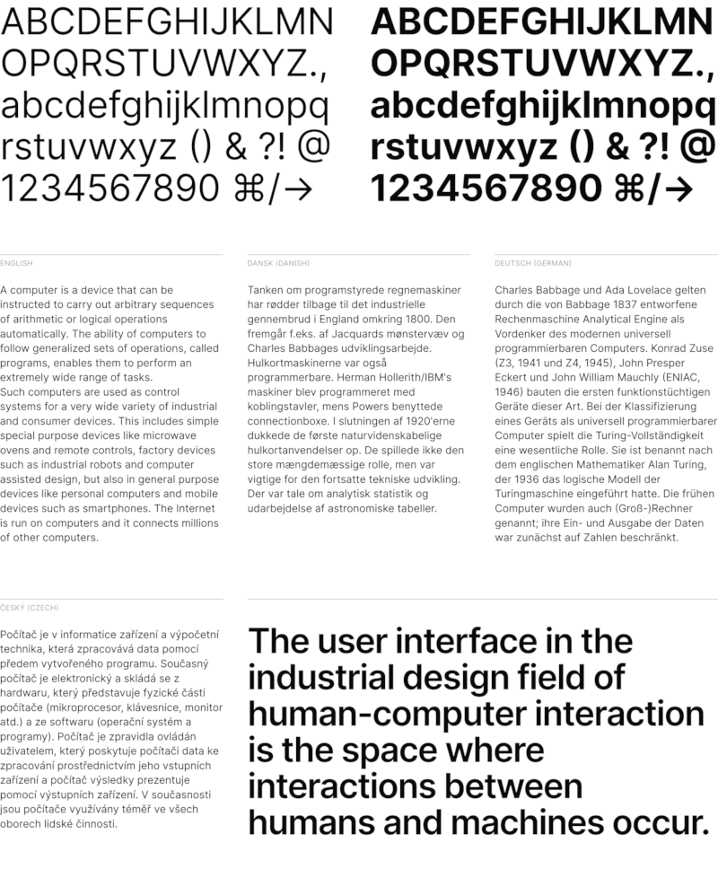
Inter is a typeface carefully crafted & designed for computer screens. Inter features a tall x-height to aid in readability of mixed-case and lower-case text. Inter is a variable font with several OpenType features, like contextual alternates that adjusts punctuation depending on the shape of surrounding glyphs, slashed zero for when you need to disambiguate "0" from "o", tabular numbers, etc.
Quick questions
- Where can I get Inter? Here
- I think I found a bug. How can I let you know? Open an issue here
- I have a question. Where can I get help? Post in Discussions Q&A
- Should I use Inter from Google Fonts? No, unless you have no other choice. (outdated, no italics)
- Can I legally use Inter for my purpose? Most likely yes! Inter is free and open source. (Read the license for details.)
Using & installing Inter
Download the latest font files…
Using Inter on a web page:
<link rel="preconnect" href="https://your-font-file-host/">
<link rel="stylesheet" href="https://your-font-file-host/inter.css">
:root { font-family: 'Inter', sans-serif; }
@supports (font-variation-settings: normal) {
  :root { font-family: 'Inter var', sans-serif; }
}
For web pages, there's an official CDN distribution that you can use directly without having to host the font files yourself:
<link rel="preconnect" href="https://rsms.me/">
<link rel="stylesheet" href="https://rsms.me/inter/inter.css">
Alternate distributions
- NPM
inter-ui - Homebrew
font-inter - Ubuntu
fonts-inter - List of Inter available on various Linux distributions…
- Google Fonts
Disclaimer: Alternate distributions may not always be up-to-date.
Notable uses of Inter
- ElementaryOS
- Figma
- GitLab
- Guggenheim museums (case study)
- ISO (International Organization for Standardization) (case study)
- Minimalissimo magazine
- Mozilla
- NASA
- Pixar Presto
- Switzerland, Canton of Zurich
- Unity
- Zurich Airport
Have you made something nice with Inter?
Please share in Show & Tell! →
Notable forks
- Open Runde is a rounded variant of Inter
- Interalia extends Inter with Shavian characters
- Raveo is a "warmer version" of Inter
Supporters & contributors
A wholehearted Thank You to everyone who supports the Inter project!
Special thanks to @thundernixon and @KatjaSchimmel who have put in significant effort into making Inter what it is through their contributions ♡
See graphs/contributors for a complete list of all contributors.
Contributing to this project
For instructions on how to work with the source files and how to compile & build font files, refer to CONTRIBUTING.md.
Inter is licensed under the SIL Open Font License
Creating derivative fonts
Inter is open source which means you can make your own versions with your own changes. However when doing so, please read LICENSE.txt carefully. It is a standard SIL Open Font License 1.1:
The goals of the Open Font License (OFL) are to stimulate worldwide development of collaborative font projects, to support the font creation efforts of academic and linguistic communities, and to provide a free and open framework in which fonts may be shared and improved in partnership with others.
The OFL allows the licensed fonts to be used, studied, modified and redistributed freely as long as they are not sold by themselves. The fonts, including any derivative works, can be bundled, embedded, redistributed and/or sold with any software provided that any reserved names are not used by derivative works. The fonts and derivatives, however, cannot be released under any other type of license. The requirement for fonts to remain under this license does not apply to any document created using the fonts or their derivatives.
While you are allowed to use Inter commercially, i.e. bundled with product or service which makes you money, you are NOT allowed to sell Inter itself or derivatives of Inter. If you would like to do so, please reach out and we can talk about it.
Inter a trademark of Rasmus Andersson (DBA: RSMS)
"Inter" is a Reserved Font Name by Rasmus Andersson (font vendor code RSMS.)
Design
This section discusses some of the design choices made for Inter.
Inter can be classified as a geometric neo-grotesque, similar in style to Roboto, Apple San Francisco, Akkurat, Asap, Lucida Grande and more. Some trade-offs were made in order to make this typeface work really well at small sizes:
-
Early versions of Inter was not suitable for very large sizes because of some small-scale glyph optimizations (like "pits" and "traps") that help rasterization at small sizes but stand out and interfere at large sizes. However today Inter works well at large sizes and a Display subfamily is in the works for really large "display" sizes.
-
Rasterized at sizes below 12px, some stems—like the horizontal center of "E", "F", or vertical center of "m"—are drawn with two semi-opaque pixels instead of one solid. This is because we "prioritize" (optimize for) higher-density rasterizations. If we move these stems to an off-center position—so that they can be drawn sharply at e.g. 11px—text will be less legible at higher resolutions.
Inter is a variable font and is in addition also distributed as a set of traditional distinct font files in the following styles:
| Roman (upright) name | Italic name | Weight |
|---|---|---|
| Thin | Thin Italic | 100 |
| Extra Light | Extra Light Italic | 200 |
| Light | Light Italic | 300 |
| Regular | Italic | 400 |
| Medium | Medium Italic | 500 |
| Semi Bold | Semi Bold Italic | 600 |
| Bold | Bold Italic | 700 |
| Extra Bold | Extra Bold Italic | 800 |
| Black | Black Italic | 900 |
