2 unstable releases
| 0.1.0 | Jan 14, 2024 |
|---|---|
| 0.0.1 | Dec 29, 2023 |
#668 in GUI
61KB
761 lines
Floem UI Kit
Want a pretty Rust GUI with minimal time investment? Use a kit of premade UI components! Floem UI Kit provides themed widgets you can use in conjunction with the Floem GUI library.
- ✅ Supports all major desktop operating systems
- ✅ All widgets implement hover, focus and disabled state
- ✅ Supports multiple accent colors
⚠️ Floem UI Kit, like Floem, is experimental software. Breaking API changes may regularly happen. ⚠️
First time using Floem?
Its README and documentation provide a quick start example, an introduction and some background on Floem's architecture. You might notice that it incorporates familiar concepts from other UI frameworks, including:
- Interface composition using nestable horizontal and vertical widget containers
- A styling system that brings many CSS-like features to Rust, without the overhead of a browser runtime
- Reactivity using signals, as seen in frameworks like SolidJS
- Implementation of UIs using functions, similar to Jetpack Compose
Installation
You'll need to install a compatible Floem version along with Floem UI Kit. To see which Floem version we're currently based on, go to Cargo.toml.
Getting started with Floem UI Kit
The Floem UI Kit workflow involves:
- Creating an instance of
floem_ui_kit::theme::Theme.Theme::default()creates an instance with default settings. - Using the widget creation methods in
Themeto build your UI. If Floem UI Kit doesn't have exactly what you want, you can mix and match with self-written UI components. You can keep using Floem'sv_stackandh_stackmethods to lay out your components. - Wrapping your window contents in Floem UI Kit's padded container to ensure your widgets don't stick to the side of the window.
- Wrapping the padded container in Floem UI Kit's root view to apply the theme to the entire window.
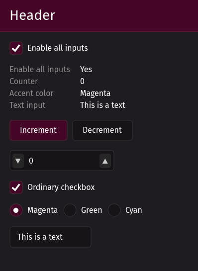
Over here you'll find Floem's quickstart example ported to Floem UI Kit. Here is a reference render:
These components are still sticking to one another. You'll probably want to add a small gap between them. v_stack and h_stack can automatically add those gaps, provided that you request it:
v_stack(/* .. */)
	.style(|s| s.gap(0.0, 10.0))
The above will add no horizontal gap and a vertical 10-pixel gap.
Supported widgets
For more information on how to use these, see the code docs.
| Widget | Preview |
|---|---|
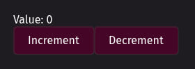
| Button (multiple variants) | 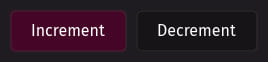 |
| Checkbox |  |
| Integer input (spinbox) | 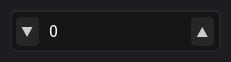 |
| Label (multiple variants) | 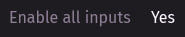 |
| Radio group (multiple variants) |  |
| Simple header |  |
| Text input |  |
For an example incorporating all available widgets, see here. It's the source code for the screenshot at the top of the README.
Not quite what you're looking for?
You can browse the floem-themes topic on GitHub to look for other Floem UI libraries and themes.
As far as Rust UI libraries go, Iced is a well-known one. Device manufacturer System76 is using it to implement its own desktop environment. You might be able to build onto their work by checking out libcosmic. Be advised that its learning curve may be a bit steeper than Floem's, and that the library is primarily intended for use by applications that are native to the Cosmic desktop environment.
If you're willing to consider Electron-like solutions that are not completely native and may have a larger resource footprint, I'd definitely check out Tauri. Since it's built on HTML/JS/CSS, you can use it with any web-based UI framework.
And finally, Are we GUI yet? is a big collection of GUI-related tools.
Dependencies
~36–77MB
~1.5M SLoC